In A Nutshell
Hello there, I'm Haydn, UX Engineer and retired college athlete. As a developer, my passion is utilizing my coding skills to craft immersive and user-centric web experiences. With a background in UI/UX design and proficiency in Adobe Suite products like Illustrator, Photoshop, and InDesign, I bring a holistic approach to every project. This digital showcase features a curated collection of endeavors that showcase my proficiency in HTML, CSS, and JavaScript, as well as my dedication to creating functional yet visually captivating websites. Explore the diverse range of projects, and discover how I blend creativity with technical expertise to leave a lasting digital impression.
Recipient of the Silver Award at the 48th Annual CADC Awards Show
See Work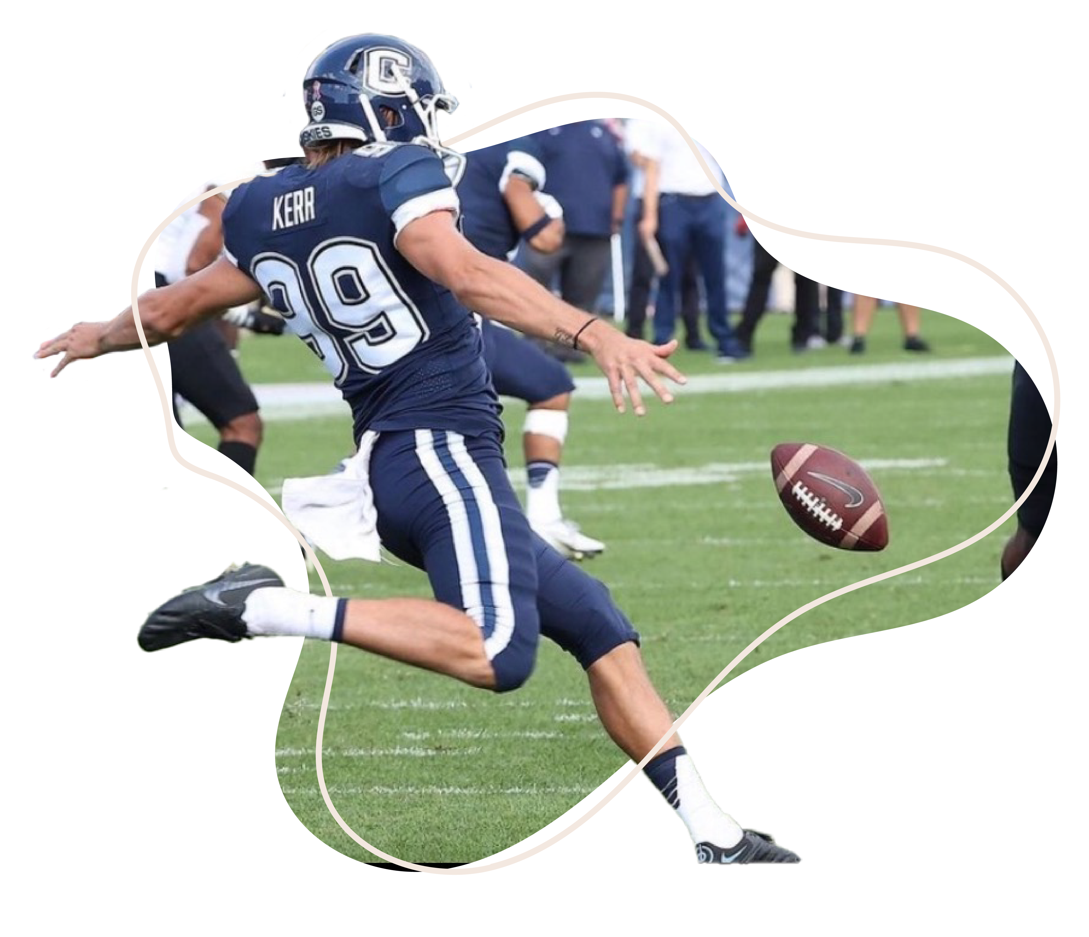
Developer
As a developer, I find immense satisfaction in employing logic and problem-solving skills to unravel challenges and make things function seamlessly. Nothing beats the gratification I feel when I finally crack a bug that has consumed hours of my time. This inclination for problem-solving extends to a deep fascination with a wide array of puzzles
Languages
HTML, CSS, Javascript, Python
Tools
Github, Bootstrap, Github, VS Code, Webflow, Wordpress, React
Designer
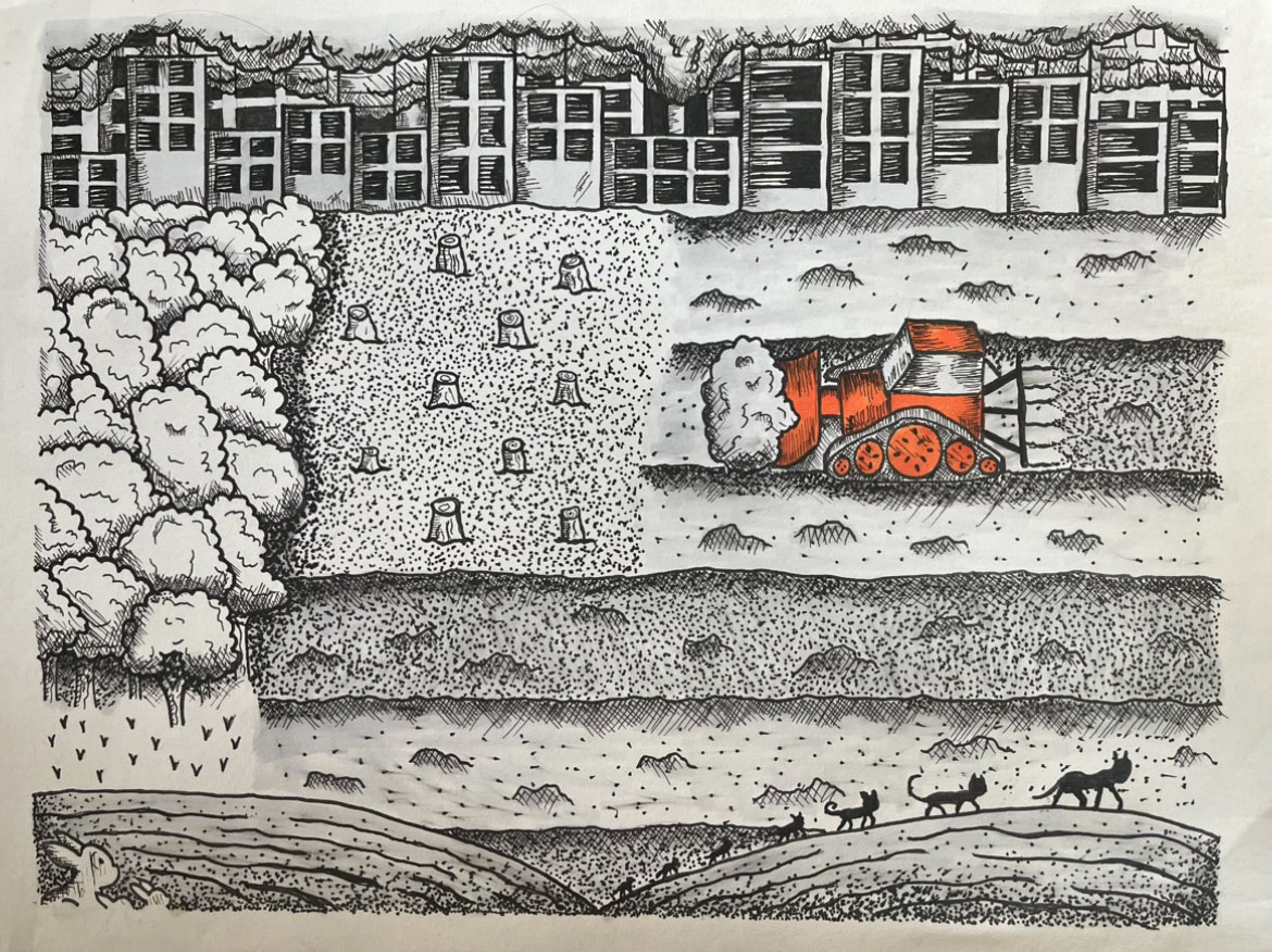
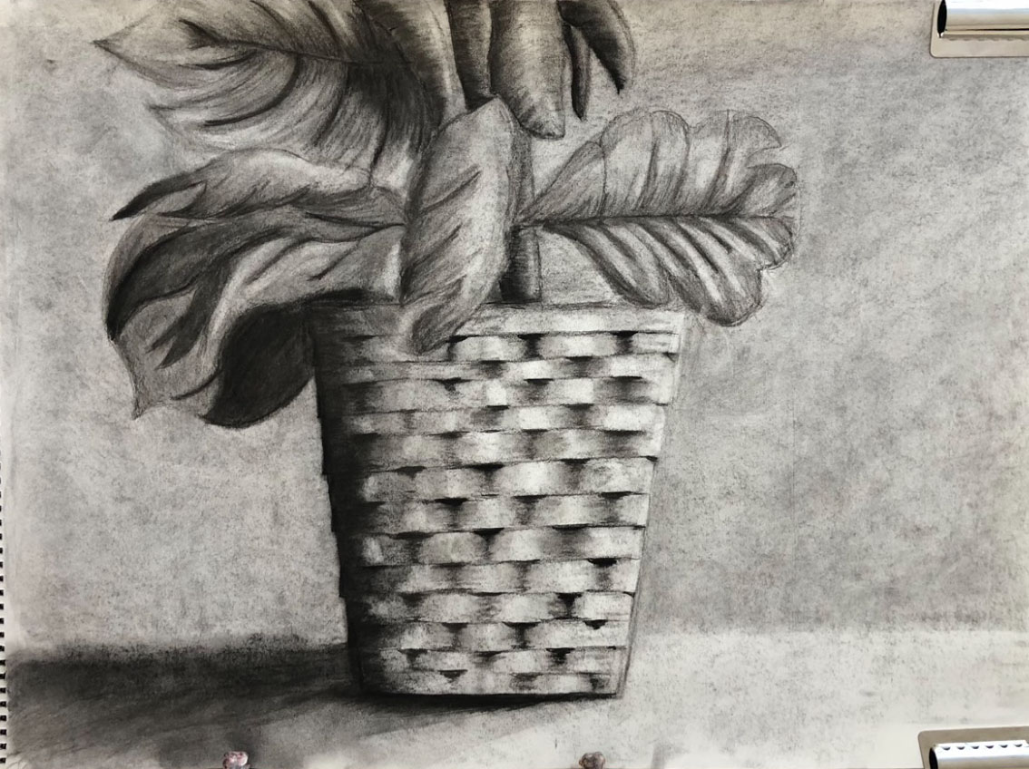
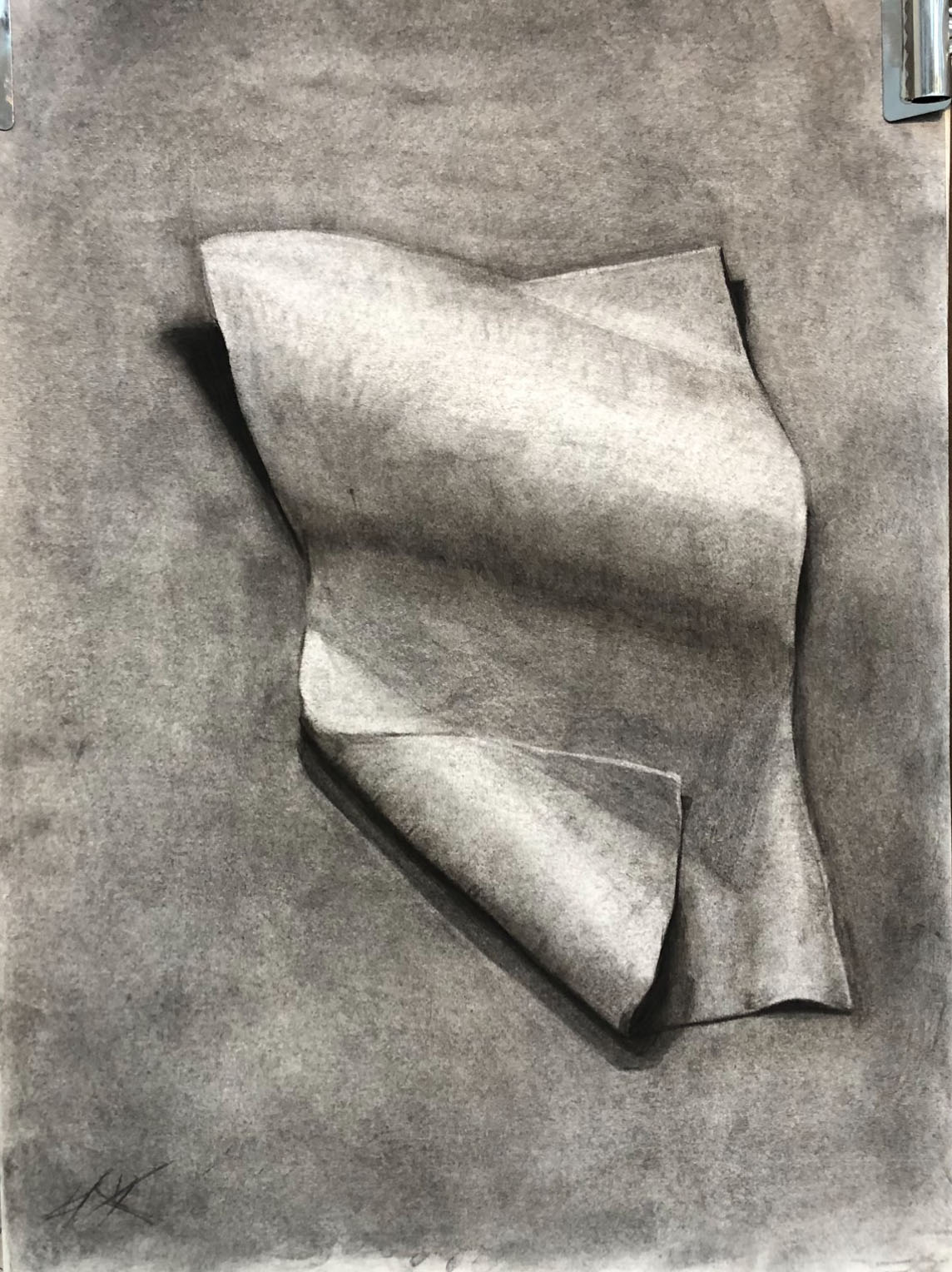
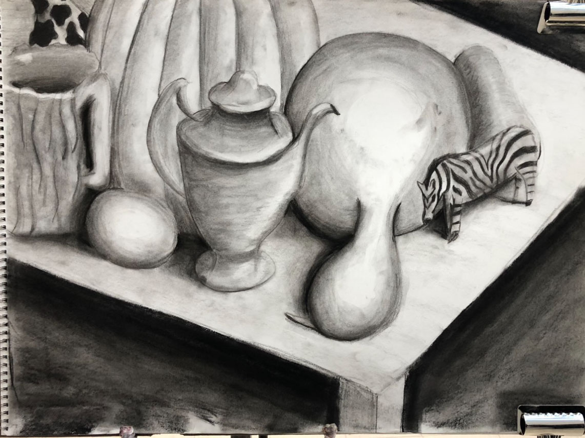
As a designer, I find great joy in channeling my creativity into crafting unique and captivating designs. This encompasses a wide range of projects, from creating eye-catching logos to designing engaging print media and conceptualizing website/app mockups. Each endeavor presents an exciting opportunity to fuse artistry with functionality, ensuring a seamless and visually stunning end result
What I use:
Illustrator, InDesign, XD, Photoshop, Illustrator, Figma, pencil & paper, paint on canvas
Educator
As an educator, I've long been aware of the privilege bestowed upon me by access to abundant resources and a quality education. This awareness has ignited within me a fervent commitment to democratizing knowledge and championing accessibility. I've recently embarked on a new venture: a YouTube channel. Through this platform, I aim to offer easily digestible tutorials and project-based learning sessions. My goal is to serve as a guide for aspiring web developers, providing them with the tools and confidence they need to embark on their own learning journeys.
Platform:
Professional Experience
Nutmeg
Lead Designer
DX Group
Frontend Developer
Stepping Stones
Frontend Designer / Developer
Overview
As a Frontend Developer at the Digital Experience Group, I played a pivotal role in crafting seamless and visually engaging digital interfaces for the University of Connecticut. Specializing in web and app development, I leveraged my expertise in HTML, CSS, and JavaScript to create intuitive and aesthetically pleasing user experiences.
My responsibilities included working extensively with popular hosting platforms such as WordPress and Wix, where I implemented frontend solutions that seamlessly integrated with these environments. This involved ensuring that the designs were not only visually appealing but also functionally effective, providing users with a smooth and satisfying interaction.
Furthermore, I collaborated closely with the design and backend development teams to bring projects to fruition, ensuring a cohesive and user-centric final product. This role demanded a keen attention to detail, a solid understanding of best practices, and a commitment to delivering high-quality, accessible digital experiences.
See Work
Overview
As the Lead Designer at Nutmeg Publishing, I held a key position within this student-run organization responsible for crafting the University of Connecticut's yearbook. My role involved overseeing the design process from concept to completion, leading a team of designers, and ensuring a cohesive and visually compelling final product.
Central to my responsibilities was the creation of spreads within the yearbook, expertly blending a mix of photos and text to tell the story of the academic year. To accomplish this, I proficiently utilized industry-standard design software including Illustrator, Photoshop, and InDesign.
By orchestrating the design process, collaborating closely with team members, and harnessing my skills in graphic design, I played a pivotal role in producing a memorable and cherished memento for the university community. This role demanded a keen eye for detail, strong leadership abilities, and a deep commitment to preserving the essence of each academic year through visual storytelling.
Overview
In my role as the Designer and Developer for the museum's website, I led efforts to significantly enhance its online presence, visibility, and user engagement. This included a complete redesign and launch of a modern, streamlined website with over 20 pages. The redesign focused on improving user experience, reducing unnecessary elements, and ensuring alignment with the museum’s playful and vibrant brand identity as a children’s museum.
Collaborating closely with the graphic design, marketing, and museum exhibits teams, I managed the entire design process—from conceptual graphic design and user-centric web design to final development and deployment using Webflow. Additionally, I optimized website performance by increasing SEO scores from 88% to 95% and boosting organic traffic by 34%, contributing to greater visibility and enhanced user engagement.
This role cultivated my expertise in interdisciplinary collaboration, creative problem-solving, and full-cycle web development. It resulted in a website that not only reflects the museum’s mission but also delivers measurable results in terms of performance and audience reach.
See Work
X
Web Development
Interactive Exhibit
Learn MoreFullstack App
Learn MoreOnline Game
Learn MoreCoding Challenges
Learn MoreOnline Game
Learn MoreWebsite Redesign
Learn MoreWebsite Redesign
Learn MoreWebsite Redeisgn
Learn MoreLanding Page
Learn MoreLanding Page
Learn MoreWebsite Redesign
Learn MoreLanding Page
Learn MoreWebsite Series
Learn MoreWebsite Redesign
Learn MoreMobile App
Learn MoreWebsite
Learn More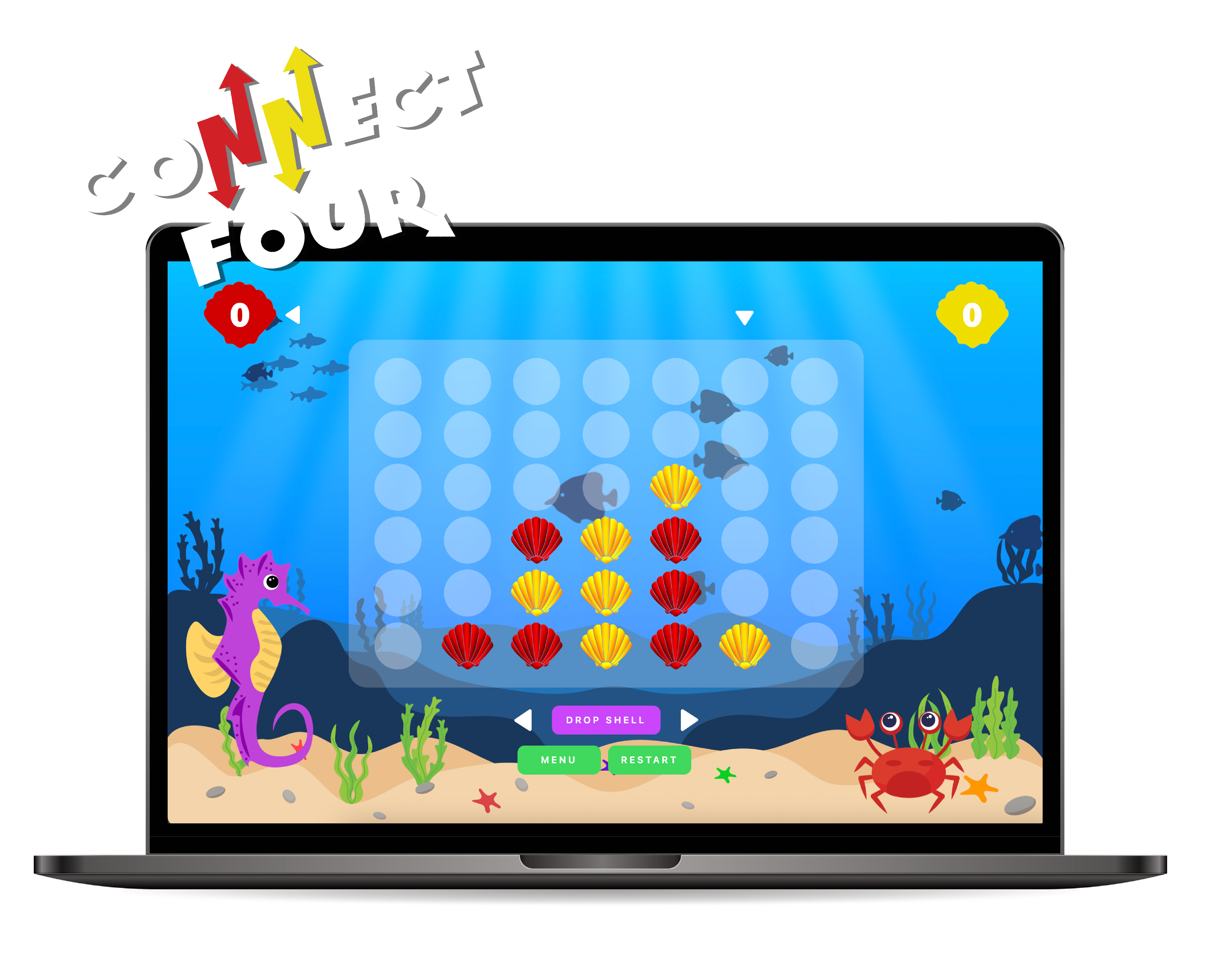
X
Online Desktop Game
Connect Four
HTML CSS Express JS Socket.io
One of my favored portfolio pieces is the Under the Sea Connect Four-style game . This project was a deliberate showcase of my proficiency in HTML, CSS, and JS, coupled with a flair for creativity. By reimagining a classic game in an underwater setting, I aimed to demonstrate not only technical skills but also a keen eye for design.
Throughout the development and learning process, I delved deep into various JavaScript techniques, with a strong emphasis on manipulating arrays and optimizing loops. This endeavor led me to revisit and refine my code repeatedly. The process involved streamlining complex segments, resulting in a more concise and efficient codebase.
The latest update, adds the integration of online multiplayer capabilities, allowing users to compete against opponents remotely, adding a dynamic and interactive dimension to the game. Through the use of socket.io and hosting the server on render.com this was both a challenging and fun learning experience.
X
Online Desktop Game
Lillie's Memory Pads
HTML CSS Express JS Supabase
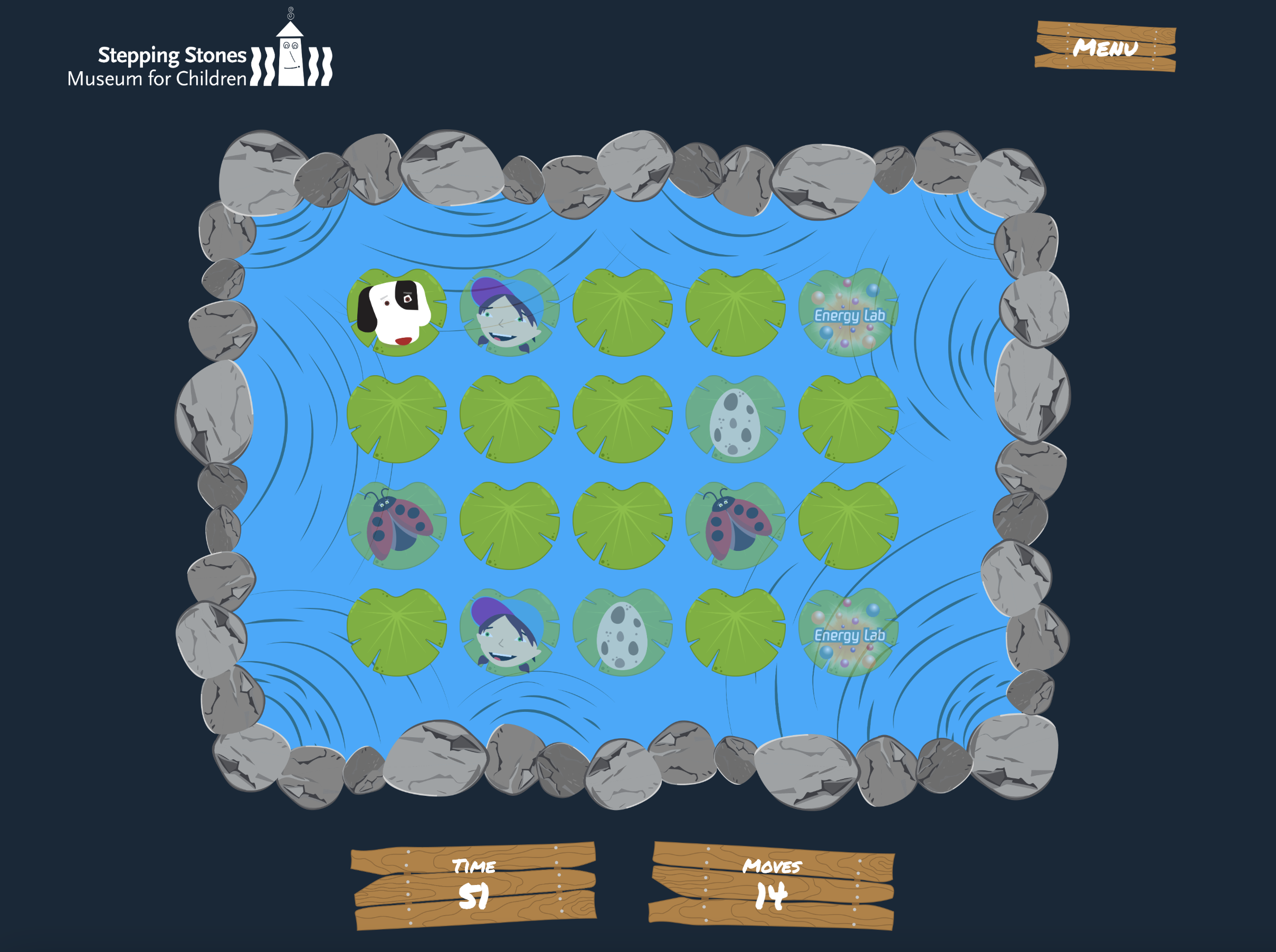
One of my projects as a web developer at a children's museum is a pond-themed memory game . featuring lily pads, inspired by our ladybug mascot, Lillie. I built the game using JavaScript and integrated Supabase to create a global leaderboard, which updates every time a player finishes a game and displays the top 8 scores.
During development, I faced a few key challenges. One was implementing a filter to remove inappropriate words from user-entered names, ensuring a family-friendly experience. Another was styling the game board to accommodate four different grid sizes, requiring careful adjustments for layout and responsiveness.
The project is still a work in progress—I plan to add animations, sound effects, and further refine the responsiveness to enhance the overall user experience. Despite these remaining tasks, the game is already functional and engaging, and it has been a great opportunity to apply my skills in JavaScript, database management, and UI design.

X
Fullstack Web Application
BeeHive
HTML Bootstrap Express.JS SQL
Username: beehive@gmail.com
Password: Bumblebee123!
BeeHive stands as my latest achievement—a full-stack web application developed as part of a semester project. Inspired by prominent social media platforms such as Yik Yak and Reddit, its primary objective was to construct a comprehensive solution from inception to execution. Embracing diverse technologies and frameworks, BeeHive was meticulously crafted to deliver an intuitive and seamless user experience, spanning from initial design to backend implementation.
Leveraging Nunjucks for dynamic JavaScript functionality and harnessing the power of Bootstrap for sleek and responsive design, the frontend experience is polished to perfection. On the backend, the application is fortified with Express.js, ensuring robust server-side operations. Complementing this framework ecosystem is the integration of a SQL database managed through Supabase, facilitating seamless data storage and retrieval.
Being one of my initial forays into full-stack development, BeeHive stands as a testament to my journey and growth in this field. I take immense pride in its creation and view it as a foundation upon which I aim to build further. Moving forward, I am eager to enhance BeeHive with additional features and refinements, leveraging each iteration as an opportunity for continuous learning and improvement.
X
Wix Website
Miracles for Satos Rescue
UI/UX
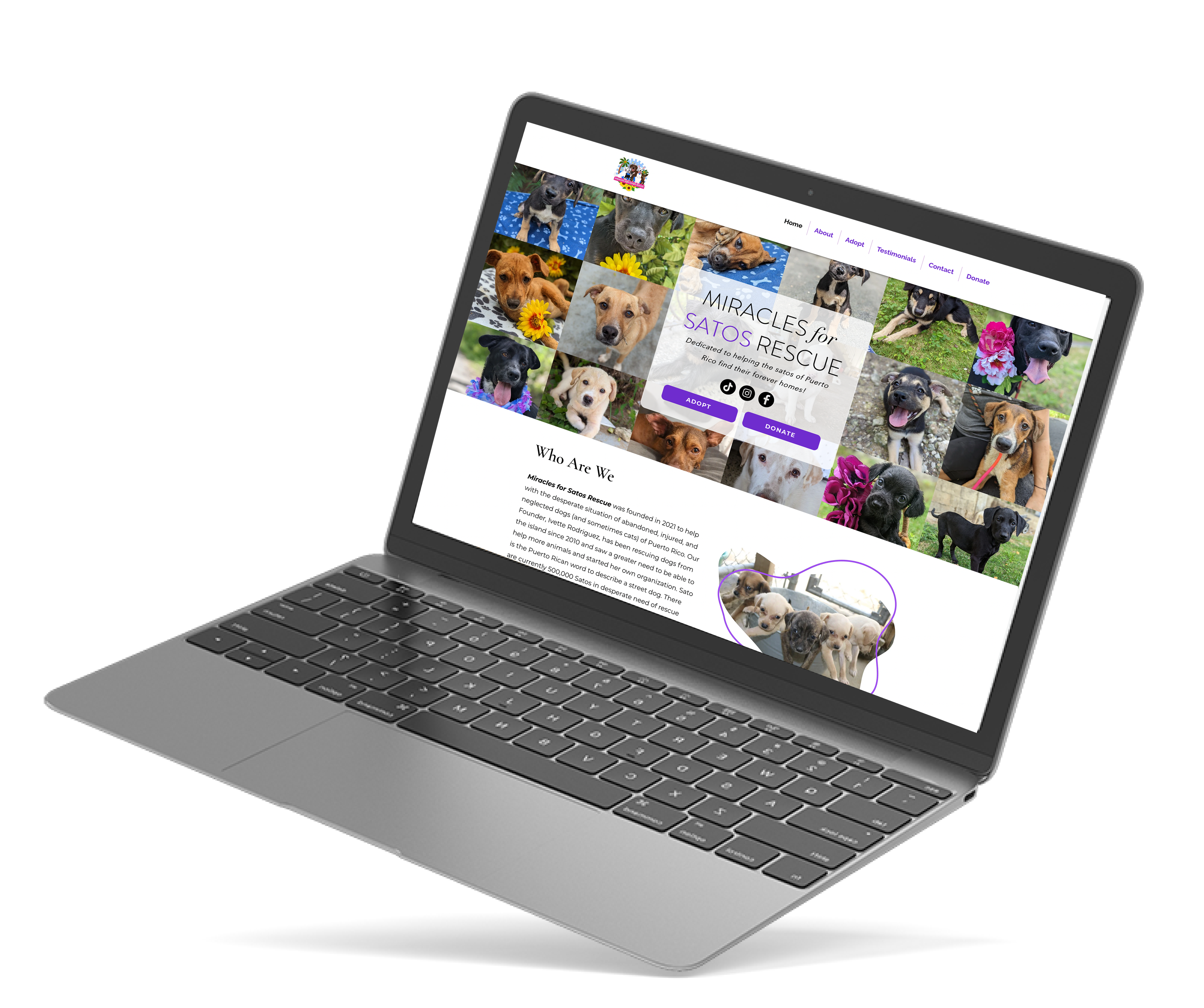
One of my most gratifying projects involved a pro bono collaboration with the "Miracles for Sato Rescue" in Puerto Rico. This non-profit organization, dedicated to canine welfare, entrusted me with the task of completely revamping their website to create a more user-friendly and visually appealing experience.
This endeavor marked my inaugural venture into Wix, providing me with a hands-on introduction to the platform. As I immersed myself in this project, I gained a comprehensive understanding of Wix's capabilities and identified areas for improvement.
During our consultations, the owners expressed concerns about the perceived professionalism of their previous website, noting its lackluster design and absence of visually captivating elements. With their trust and support, I assumed full creative control of the redesign process.
Upon the unveiling of the revamped site, the "Miracles for Sato Rescue" experienced a remarkable surge in engagement and inquiries. Witnessing the tangible impact of the redesign not only validated the significance of user-centric UI/UX design but also reaffirmed my belief in the power of design to drive positive change.
X
Hand Coded Website
Interactive Solar System
HTML CSS Vanilla JS & Three.JS
Recipient of the Silver Award at the 48th Annual CADC Awards Show
My latest personal endeavor is an engaging digital experience centered around our Solar System. . Tailored for a younger audience, it combines entertainment with education, offering a captivating journey through the wonders of our celestial neighborhood. This project not only demonstrates my proficiency in HTML, CSS, and JS, but also highlights my expertise in UI/UX design. The user interface is thoughtfully crafted to ensure intuitive navigation and an enjoyable learning experience. Additionally, I incorporated three.js for dynamic 3D rendering and utilized Blender in the 3D modeling phase, enhancing the visual richness of the Solar System representation.
Throughout this project, I gained invaluable insights into the synergistic potential of CSS and JS in crafting an immersive user experience. A notable revelation was the powerful role of CSS animations, which played a pivotal role in vividly illustrating the orbital movements of planets around the sun.
In summary, the Solar System Adventure project is a testament to my technical skills in web development and design, as well as my dedication to creating immersive and educational digital experiences. It serves as a gateway to the wonders of space, tailored specifically for the curious minds of tomorrow.

X
Wordpress Website
Floe
UI/UX HTML CSS JS
Floe , a forward-thinking technology company, sought a complete overhaul of their outdated website, which was failing to meet industry standards in both design and SEO. The previous website lacked user engagement and failed to effectively communicate Floe's innovative solutions.
In response to Floe's needs, I designed and developed a visually appealing website that prioritized user experience and SEO optimization. Utilizing a combination of modern design principles and intuitive navigation, the new website guided visitors through their exploration based on their interests and needs.
The revamped Floe website represents a significant improvement over its predecessor, meeting industry standards and exceeding client expectations. With its intuitive navigation and visually compelling design, the new website enhances user engagement and communicates Floe's value proposition more effectively.
Visit Site
X
Webflow Site
Stepping Stones Museum for Children
UI/UX HTML CSS JS
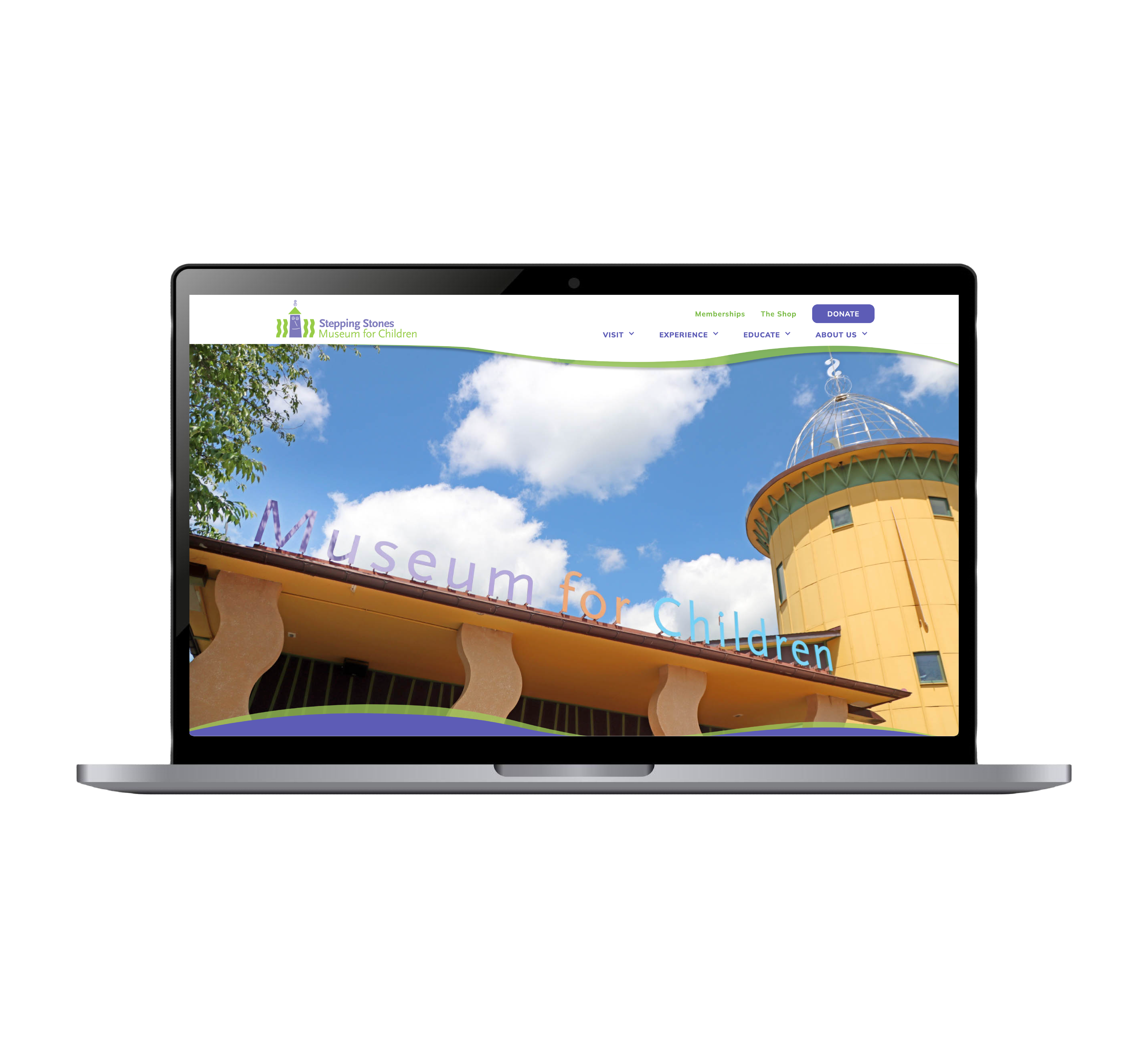
One of my standout projects as a web developer at the children’s museum was the complete redesign of its website, a transformation aimed at enhancing both user engagement and online visibility. With over 20 pages, the new site was carefully crafted to provide a modern, streamlined experience while staying true to the museum’s playful and vibrant brand identity.
The redesign process involved close collaboration with the graphic design, marketing, and museum exhibits teams, ensuring that every element—from conceptual design to final development—aligned with the museum’s mission. Using Webflow, I handled everything from user-centric web design to full-scale deployment. Beyond aesthetics, I focused on performance optimization, increasing SEO scores from 88% to 95% and boosting organic traffic by 34%, leading to greater audience reach and engagement.
This project not only showcased my technical skills in web design and development but also strengthened my ability to manage interdisciplinary collaboration and problem-solving. The result is a visually engaging and high-performing website that effectively connects users with the museum’s offerings.
X
Wordpress Site
UConn Neuroscience Department
UI/UX
I am proud to unveil the enhanced landing page for the University of Connecticut Health Center's Neuroscience Department. This project aimed to elevate user engagement by overhauling the landing page design using WordPress as the foundation. Integrating custom HTML and CSS, I crafted a visually captivating experience, incorporating high-quality images and custom backgrounds to add a unique touch to each section.
The project's key features include a visually appealing design, personalized container backgrounds, and a responsive layout to ensure optimal performance across devices. Despite challenges in aligning the creative vision with WordPress constraints and university standards, the final result surpassed expectations.
The upgraded landing page reflects a commitment to excellence, meeting university standards while providing an enriched user experience. Future plans include redesigning the inner pages to extend the improved aesthetics and functionality throughout the entire website.
This project showcases my dedication to delivering not just functionality but a visually captivating and standards-compliant online presence. I welcome feedback and anticipate future collaborations to continue enhancing the department's digital presence.
X
Wordpress Site
CT NERR
Connecticut National Estuarine Research Reserve
UI/UX
Redesigning the landing page for the Connecticut National Estuarine Research Reserve marked a significant milestone for me, being my inaugural venture into WordPress development. This project not only allowed me to familiarize myself with the platform's functionalities but also posed a unique challenge: designing in a way that empowers a non-web designer to seamlessly take over maintenance and make adjustments.
Working within these parameters, I approached the project with a dual focus. Firstly, I sought to create a visually appealing and intuitive landing page that effectively conveyed the organization's message. Secondly, I ensured that the design was structured and documented in a manner that would empower a non-technical user to manage the site effortlessly.
Through this experience, I gained a deep appreciation for the balance between design aesthetics and user-friendly functionality. The WordPress platform, with its extensive ecosystem of plugins and intuitive interface, provided a robust foundation for achieving these goals.
The successful launch of the redesigned landing page not only bolstered the online presence of CT NERR but also demonstrated the potential for WordPress to serve as an accessible platform for non-technical users. This project stands as a testament to the power of thoughtful design and user empowerment in web development.
X
Wordpress Site
COR²E Facility
Center for Open Research Resources & Equipment
UI/UX
I took on the challenge of migrating and redesigning the University of Connecticut COR²E Facility's website to facilitate easy content management for non-technical users. The primary goal was to transition the site to WordPress, providing an intuitive platform for updates and modifications. Concurrently, we focused on revamping the user interface to create a visually appealing and user-friendly experience.
Through meticulous customization and user-centric features, we ensured that individuals without coding expertise could efficiently manage and update the website. This strategic migration empowered the University of Connecticut Core Facility staff to effortlessly modify content, keeping their online presence current. The redesigned layout and improved navigation menus streamlined the user's journey, making it easier for visitors to find relevant information.
The project's success lies in the seamless WordPress migration and the thoughtful redesign. This transformation not only enabled hassle-free content management but also elevated the website's overall user experience. The project showcases our dedication to delivering accessible and aesthetically pleasing web solutions that meet the unique needs of our clients.
Visit Site
X
Coding Challenges
Frontend Mentor
HTML CSS JS
Maintaining a record of progress, regardless of perceived proficiency, is a pivotal aspect of any developmental journey. As I ventured into frontend development, Frontend Mentor emerged as a vital platform for both practice and learning.
While my earlier projects may not boast the same level of finesse as my recent endeavors, they stand as testaments to my unwavering commitment to growth and improvement. Each project represents a milestone, a tangible marker of progress along this dynamic learning path.
In the future I aim to revisit these early projects, armed with the enhanced skills and knowledge I've acquired since their creation. Moreover, I'm eager to take on more of the challenging examples that Frontend Mentor has to offer. Armed with a deeper understanding and refined skill set, I'm confident in my ability to tackle complex projects with creativity and precision. Each endeavor will serve as both a testament to my growth and a platform for continuous learning and exploration in the world of frontend development.
X
Wordpress Sites
Puerto Rico Archive Sites
UI/UX Design
Our team embarked on a significant project centered around Puerto Rico's political history and archival data. We designed three distinct WordPress websites, each dedicated to different aspects of Puerto Rico's political journey. The primary challenge was collating a vast amount of archival data and presenting it in a way that offered users an intuitive and seamless exploration experience.
The project's core objective was to create a comprehensive repository of Puerto Rico's political history through meticulous archival documentation. This involved the integration of three distinct platforms, each tailored to highlight specific historical periods or themes. The focus on intuitive navigation and user-friendly features ensured that visitors could easily access and explore the wealth of historical information.
Through careful design choices and interactive elements, we aimed to make the exploration of Puerto Rico's political history engaging and immersive. The project serves as a testament to our commitment to preserving and sharing the historical narratives of this vibrant region. The user-centric approach has transformed accessibility and understanding, providing a valuable resource for anyone interested in Puerto Rico's political evolution.

X
Wix Website
In The Crosshairs of War
UI/UX
One of my most gratifying projects involved a pro bono collaboration with the "Miracles for Sato Rescue" in Puerto Rico. This non-profit organization, dedicated to canine welfare, entrusted me with the task of completely revamping their website to create a more user-friendly and visually appealing experience.
This endeavor marked my inaugural venture into Wix, providing me with a hands-on introduction to the platform. As I immersed myself in this project, I gained a comprehensive understanding of Wix's capabilities and identified areas for improvement.
During our consultations, the owners expressed concerns about the perceived professionalism of their previous website, noting its lackluster design and absence of visually captivating elements. With their trust and support, I assumed full creative control of the redesign process.
Upon the unveiling of the revamped site, the "Miracles for Sato Rescue" experienced a remarkable surge in engagement and inquiries. Witnessing the tangible impact of the redesign not only validated the significance of user-centric UI/UX design but also reaffirmed my belief in the power of design to drive positive change.
Visit Site
X



X
